è
Service MAP is one of the great “solutions” that you can implement on top of Log Analytics (LA).
You can either activate it manually, or it can be installed automatically by other components such as Insights or Defender.
The goal of that product is to ask the Log Analytics agent (and the extension, which is mandatory) to look at 2 things and correlate them:
- The running processes, in real time (capture name, command lines, versions, etc)
- The TCP/UDP connections (create, fail, …) generated (create/receive) by these services
As a result of this capture, the Raw data can be rendered, and to make it short will tell you precisely what the server does what on the network.
Once the data is captured, it is then stored in a LA workspace, and you have 2 ways to see the analysis:
-
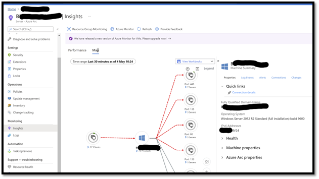
In the Azure Portal: select a server, go in Insights, and you will see a nice interface that will show you graphically the “network connectivity MAP” at server and process level. If the machine selected is also talking to other servers running the LA agent (so capturing this data, but also leveraging other components in LA such as performance counters, patch management), you will see some icons in the GUI. The goal of that interface which correlates a lot of insights is to help you when you are facing a big technical problem. It gives you a 360 vision. Also, network traffic that “used to work” (yesterday) will appear in red if they are ending up in an error. This is a great “minority report” (the film) kind of interface that will help you to quickly identify a technical problem. Here is an example of the user experience:
- Levering Kusto Queries: As the data is in a LA workspace, you can create your own analysis queries, leveraging Kusto language, for example create your own workbook report) or alert.
In this article I want to focus on this second option as it brings a lot of potential, and definitely value even more the price you pay for this service (based on the volume of data ingested, as all the other services on log analytics). Again, the GUI in Azure portal will be used for real time debug mode, where Raw data will be used to deeper analysis and alerting.
Reminder: the Agent+Extension is required
It is important to notice that you need to deploy the log analytics agent to capture this data.
In fact, you need the LA agent but also an extra piece of component calls the “Extension”, in fact the component that does the job.
The best option to deploy this scenario to leverage Azure Arc, as you will be able to manager you network with “policy driven” approach. Here is how it works:
- Activate Azure Arc in Azure, generate the PowerShell installation Script. You will then leverage TAGS (such as country, city, datacenter name, rack number).
-
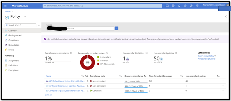
Create Azure Policies:
- One for the Log Analytic agent
- The second one for the Extension. Activate these polices with “Scope=Arc”. Check below to see the 2 policies:
- Install Arc Agent via the PowerShell Script: the machine will enroll in Arc, the policies will trigger, and install all the required components.
- Activate MAP on top of Log Analytics Workplace.
- You are done!
Once the data has arrived, you can see them in the LOGS section of LA.
Note: Online you will find very detailed document recommendations regarding the different databases generated by MAP.
Example 1: Monitoring the volume (and price) of data gathered by MAP?
As mentioned previously, in Log Analytics the price of a component is based on the amount of data collected (notion of Ingestion).
The prince includes in fact the ingestion (and all the security mechanism), the storage (for 30 days, the compute for the analysis, and the intelligence of the packs. Then after 30 days, you will extend the storage at a super light price. This pricing model is the same for all solution leveraging Log Analytics.
The idea of the examples below is to show you how you can get the max of value for this data ingested.
First let’s look at the volume so the price of the solution.
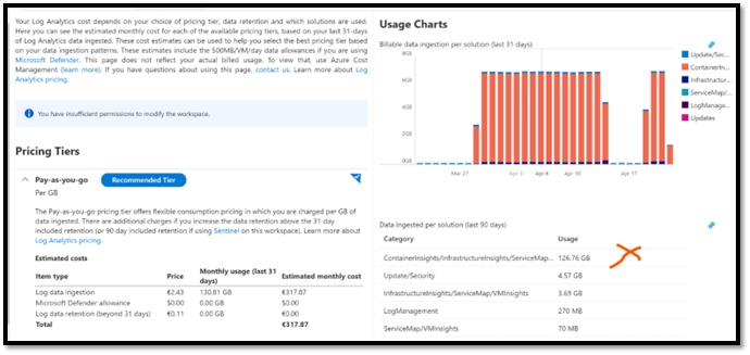
The first easy thing to do is to go in the Log Analytics workspace, pricing section, and look at the portal graphs displayed by the portal.
As you can see the “Usage Charts” section shows us “per day” global the cost of this Log Analytics workspace.
Then, for each day, it stacks “Bars”, and each section represent the graphical representation of the volume of data for a dedicated component.
On this example below, the orange bar represents “Insights”, which includes MAP. It represents the majority of data collected, here 126 GB in the last 90 days.
We can definitely extend the analysis of consumption via Kusto queries but it is not the purpose of this article. I advise you to have a look on this <TBD>.
Example 2: Count of sessions per Machine and per process
Now that we know the volume of Data, maybe it is interesting to understand the details of that capture data.
Especially which server and which server is generating data, in other words understand which server/process are the most chatty.
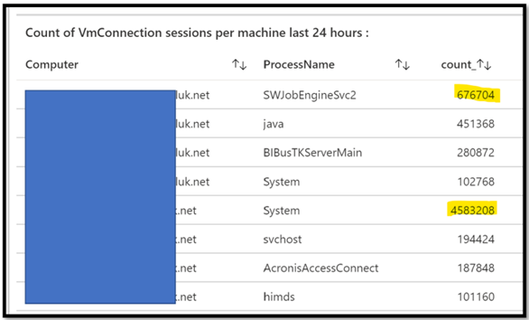
With the Kusto query below, we can identify the Servers that have the highest ratio of TCP/UDP connections
VMConnection
| join kind=fullouter(VMComputer) on $left.Computer == $right.Computer
| summarize count() by Computer, ProcessName
| where count_ >100000
| order by Computer asc, count_ desc
In this example, I have decided to display the result in a TAB visualization.
This query provides me per machine and per machine, sorted, what is the communication between my servers.
Note here that I want to focus on “count”, aka how many TCP/UDP sessions are created.
Why using Count ? Because when it comes to price, the volume of data transported by the session does not impact the pricing at all, we do not store it.
I could definitely (see later) look at volume statistics, byte sent/received, but then we will not investigate the price, rather the network usage.
Note: if you remove the ProcessName from the Kusto Query, you will have that could per machine only.
At this level you can enhance the query, for example removing well known services such as “System” and “svchost”. Then you will focus on the application layer.
The final goal is really to identify, analyze, and if it requires some adjustment find the right parameters.
Example 3: location of the remote machine, on the worldwide MAP
We have captured this raw data, and some of the TCP/UDP metadata are also captured and stored. Let’s use them to see with whom our machines are talking.
Some of these machine scans be on the private network, but some others could be on the internet, I mean here “the session is using the public IP”. Depending on the situation this could be normal or resulting of a bad configuration (bypassing network equipment, proxies, etc).
Note that without doing anything on your LA workspace configuration, the solution will the convert the public IP address of the machine on the corresponding GPS location.
As a result of that, in your Kusto query, you can use a “MAP” visualization (that will use the GPS coordinate) and have a representation of “where” the remote machines are located.
VMConnection
| where RemoteLatitude >0
| project RemoteCountry, RemoteLatitude, RemoteLongitude, BytesSent
Below is an example leveraging Workbooks directly the Azure Portal, and by selecting a “MAP” visualization:
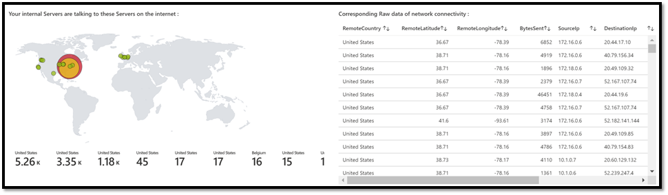
I think it really make sense to understand why your internal servers are talking directly to the internet. It could be normal, or represents a security breach.
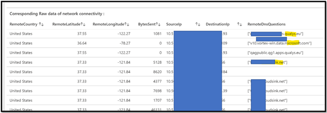
Example 4: deep dive analysis of GPS coordinates
If we want to investigate if this internet communication is normal or not, the first thing we have to look at is in fact this destination (internet) address.
We will in fact leverage the fact that the LA agent capture also the DNS request used to find the remote IP address. This will give us some very interesting clues, and then we can enhance our query to be more detailed daily.
VMConnection
| project RemoteCountry, RemoteLatitude, RemoteLongitude, BytesSent, SourceIp, DestinationIp, RemoteDnsQuestions
| order by RemoteCountry
Now we have the DNS name, not only the IP. In this example we can see that the internal machines are using Qualys.eu and Cloudsink.net, but we can also see some “Microsoft” domain names.
Now it is time for analysis, identify these domain names, and check with each product owner if it is normal. By normal I really mean “each server of the company goes directly to the internet, via a locally relay/proxy”.
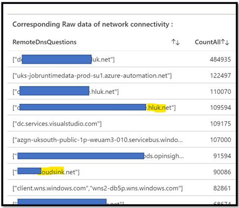
In this example you can see how we can see “only requests with FQDN” and evaluate them in terms of quantity :
VMConnection
| where RemoteDnsQuestions !=””
| summarize CountAll=count() by RemoteDnsQuestions
| project RemoteDnsQuestions, CountAll
|order by CountAll desc
Of course, you can do the exact opposite, and identify the one were we do not know the FQDN. Just remove the ! (not) on the first where.
Here is what we get in return.
In this other example where we take only FQDN connections, but we remove any connectivity coming from or to the “LocalHost”.
The goal of this example is to show you how you can enhance your own request in order to target what makes sense for you.
VMConnection
| where RemoteDnsQuestions ==”” and (DestinationIp!=”127.0.0.1″ or SourceIp!=”127.0.0.1″)
| summarize CountAll=count() by Computer
| project Computer, CountAll
Just for your info as we don’t have enough machine, we can also use Machine Learning function inside the query.
For example, below, we look at all the traffic, and ask the “cluster” ML logic to greate “clusters of machines talking together”.
We use it frequently for move 2 cloud scenarios, where we want to identify waves of migration (bunch of machines talking a lot together) :
Example 5: MAP and Move2Cloud scenarios : identify “clusters” of machines
Move2Cloud is when you want to migrate part or all your private Datacenters in Azure. As it is a project, you need first to analyze the source environment in order to plan this migration.
Usually, during the assessment (discovery) phase you need to go as “deep dive” as possible on many aspects. List of machines, running application, health (patch management, configuration, ) security, etc. Part of this long list you want to analyze at server level, in order to identify the “cluster” of machines talking to each other.
Once you have identified these blocks, you can convert then in waves of migration, so migrate “all these machines” together. As a result of that plan, when you will turn them back on, you will have no impact from a network perspective. That could imply cost due to OnPrem/Azure traffic, but more important, performance problems.
Option 6: Levering ML functions in Kusto
As MAP is gathering data regarding server/server connectivity, you can use ML algorithm to help to discover the “clusters” of machines.
This is how you can extract machine/machine traffic based on “quantity of connections” and analyze them against an AutoCluster algorithm. Of course, you can change the request, not use the count as your first approach, but rather the payload (data sent/received):
<TBD>
Option 2: Leverage Graphical capabilities of Power BI
As workbook visualizations can have some limitations, you can import the Raw data in powerBI, and leverage some other Visualizations.
Technically, you just import this data in Power BI, and then render them.
Beyond the visualization, you can also use the filtering capabilities which can also be very nice.
On this example I have used the ZoomCharts network chart component. There are others visualization that you could use but I think this is the most advanced, even with the free version.
As you can see in the values, I used Source/Destination to create the connections, and Bytes Sent (so volume of data) as the analysis option. In t is example I kept all the traffic, both internal and “internet”, sounds more like we are exploring the space:
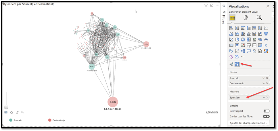
You have a great Zoom feature that you can leverage and investigate smaller clusters:
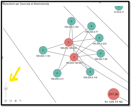
Note here that I have decided to remove 127.0.0.1 and also some Windows services such as System, lsaSS, SVCHost.
If you are an advanced PowerBI user, you can even create a more advanced interface:
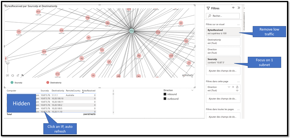
In this example I added some filters to focus on a specific subnet. By clicking a node, you interactively get more details as you can see at the bottom (machine name, source and dest IP, etc…
Example 6: ServiceMAPCompuer-CL database: get more insights from your machine
MAP can capture a lot of network data, but also on the configuration of the machine itself.
ServiceMapComputer_CL
| summarize arg_max(TimeGenerated, *) by ResourceId
| project ComputerName_s, VirtualMachineType_s, VirtualizationState_s, OperatingSystemFullName_s, DnsNames_s, Ipv4Addresses_s, CpuSpeed_d, Cpus_d, PhysicalMemory_d
As you can see you will see the name, if it is a physical or virtul machine, even the Operating System Name, and also information regarding the performance (CPU, RAM, etc).
Example 7: VMProcess database: deep dive the running process
Now let’s see the capabilities of the solution to analyze the running services.
Let’s take this query:
VMProcess
|distinct DisplayName, ProductVersion, Description, Group, CompanyName, InternalName, CommandLine, UserName, UserDomain
|order by DisplayName asc
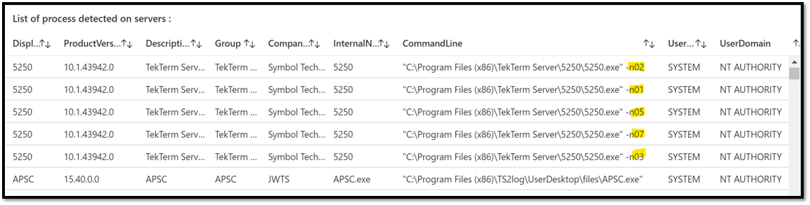
This example is interesting as we can see multiple lines for that 5250 App, why ? (because there is a distinct in the query), just because the command line is different.
Conclusion
MAP is a great component as it really – with no effort – capture a lot of data regarding service/service connectivity.
Even if it comes with a nice GUI used for mainly for debug and monitoring, understanding the Raw data captured is very key. It helps you to leverage workbooks (Kusto queries) and even other solutions such as power BI. This helps you to maximize the price you pay.
In other words, you don’t pay less, but you have more services and value for the price that you pay.
Version 1.0